
I love websites. I love them so much that when I see an awesome and inspirational website, I need to share it.
Over the years, I've seen some pretty amazing websites from choral organizations. I'll be sharing a few of these with you and some things I personally love about each of them. I hope that this inspires you when redesigning your own chorus's website!
Ensemble NYC
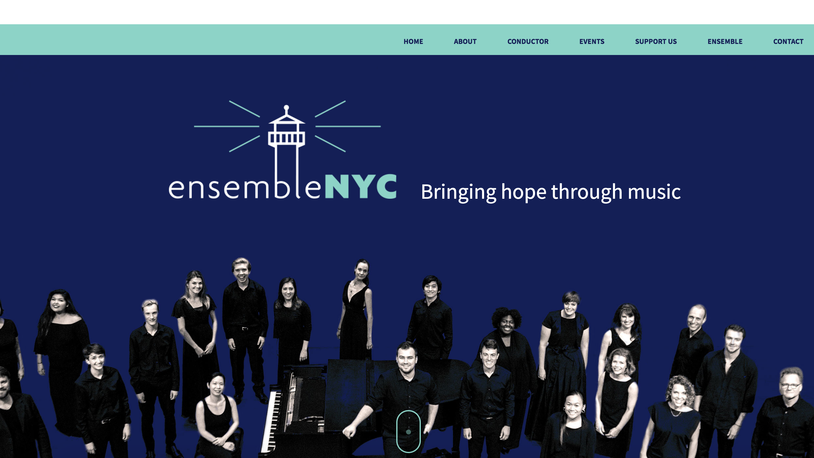
What I love about their website:
- Interactive design elements - this keeps their site visually exciting to the visitors.
- Unobtrusive pop-up at the bottom of their site to sign up for their mailing list as well as a subscription in their footer - they'll never miss an opportunity to get someone subscribed!
- Super simple navigation which directs them to content entirely on the homepage - mobile users have taken over the internet so long-form scrollable pages are in!
- Event pages initially appear in a pop-up modal instead of taking visitors off the site - this limits page load time and keeps users on their site.
- Clever collapsible "show more/less" menus appear for longer content giving users the options
- All members are highlighted with their profile pictures and a fun fact about them - all within a modal - so visitors never leave their site or have to deal with page loading time.
Pacific Chorale
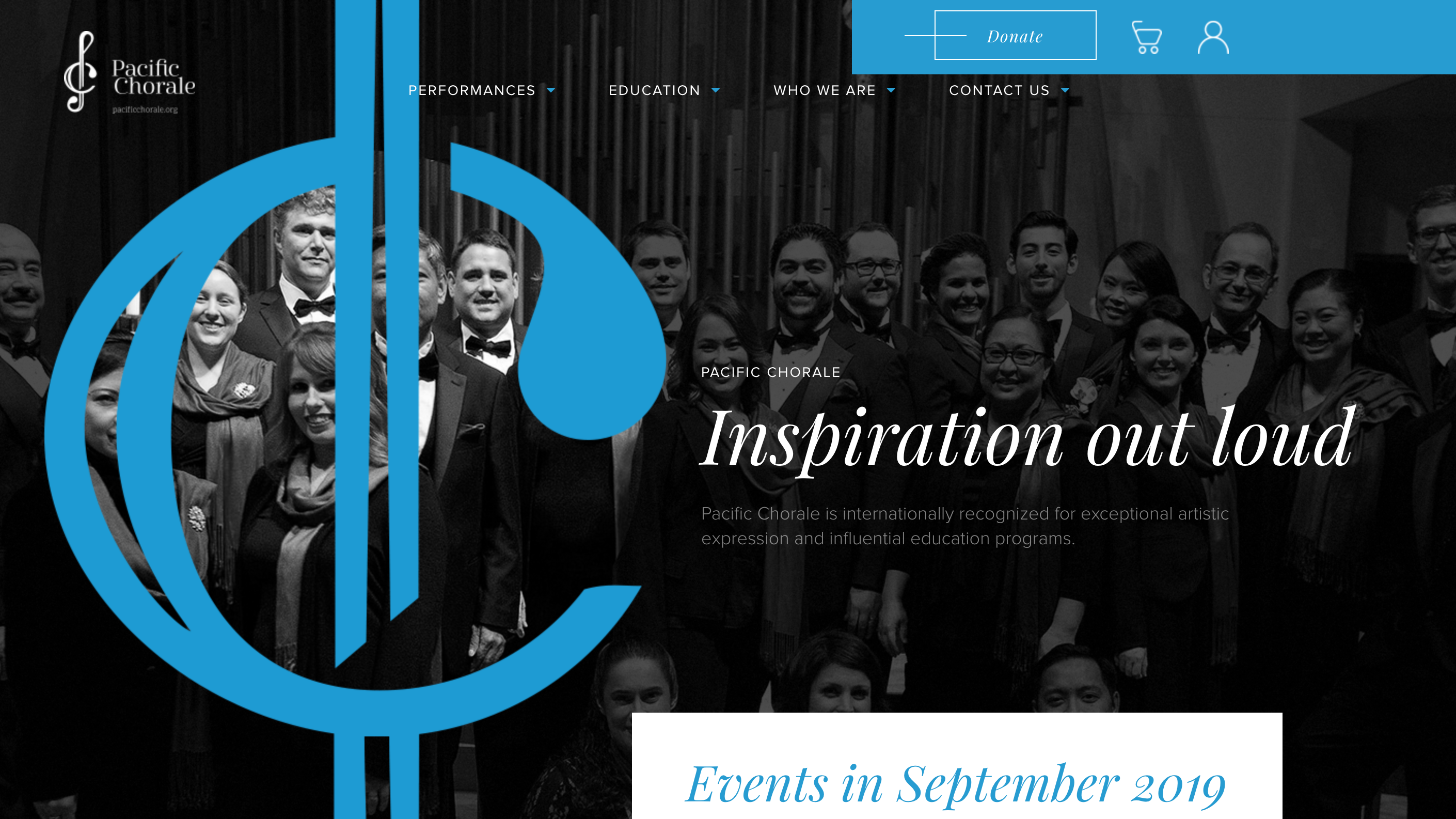
What I love about their website:
- Long form footer to list every page of the site - long footers are in!
- The homepage has a beautiful and unique logo that showcases their brand and design. Check out their beautiful banner image/logo, event calendar, and artistic staff content "blocks" for some real design inspiration.
- A great plan your experience page to answer the audience's FAQs.
- Inspirational education programs and a video.
New York City Gay Men's Chorus
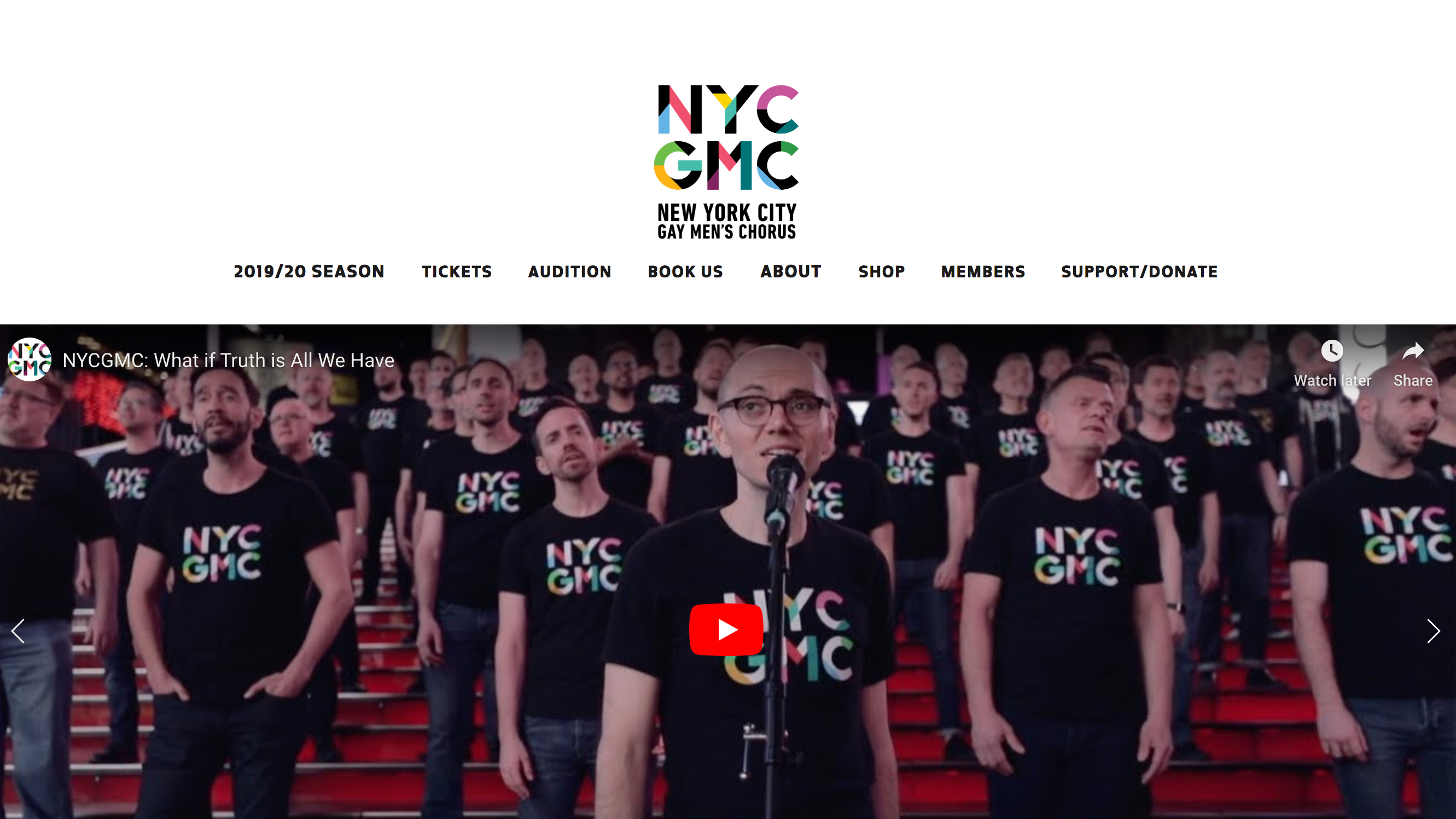
What I love about their website:
- Use of video on the homepage banner instead of images - this type of interactive content can excite web visitors and keep them on a site longer.
- Clear call-to-action above their footer to sign up for news and updates - this stay on every page so they never miss out on an opportunity to get someone to sign up for their emails!
- A page to successfully sell swag on the site.
- Support page has several options for how to support the chorus.
Children's Chorus of Washington
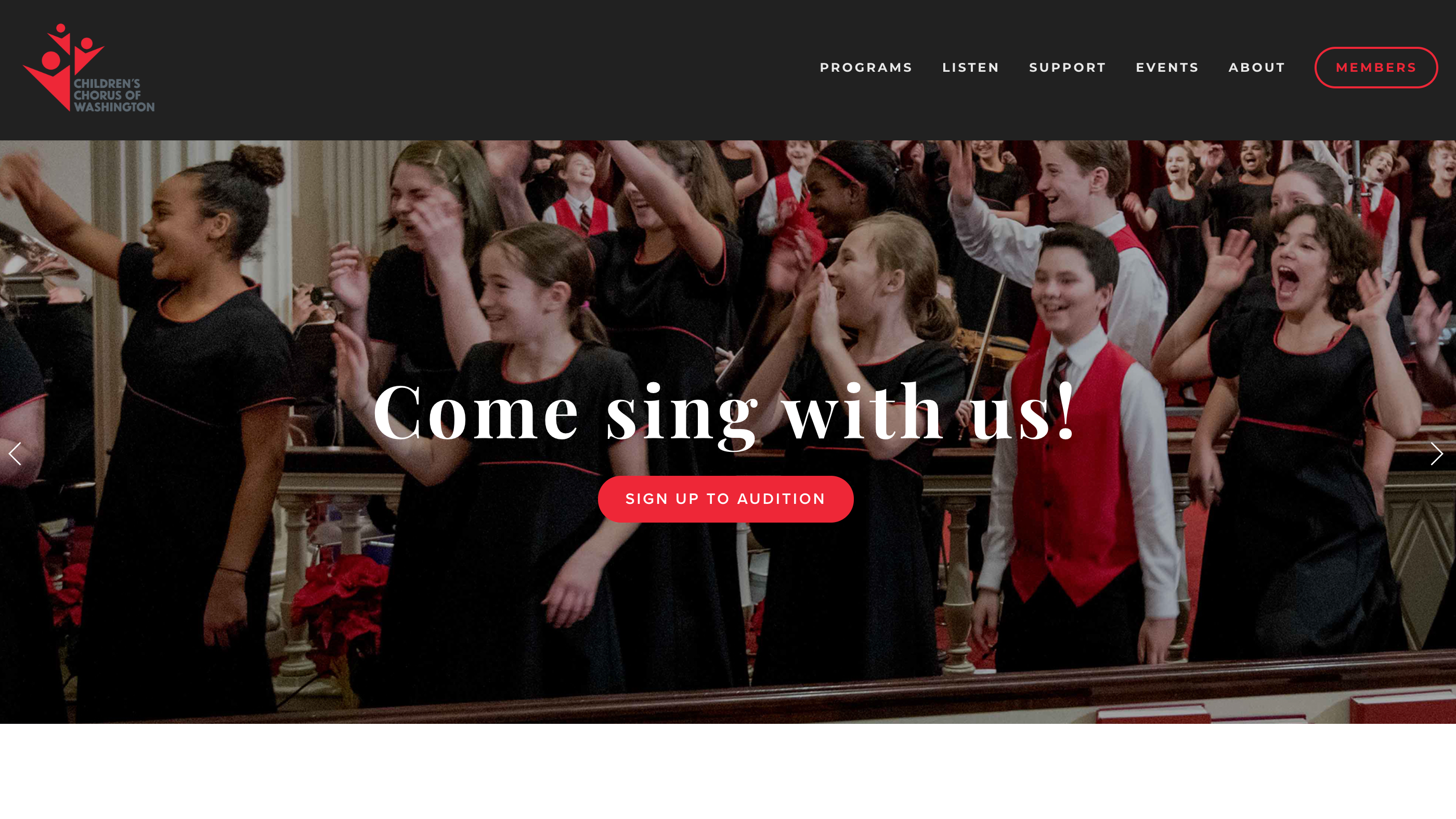
What I love about their website:
- Homepage banner images highlight their singers smiling faces and features only one button and clear call-to-action on each slider.
- Ensembles page clearly highlights each ensemble opportunity with transparent pricing and tuition fees, touring opportunities, benefits of being in the choirs, and testimonials - this is a great way to highlight several ensembles! Their testimonials and memories video is pretty great too.
- News section features great content and stories.
Nashville in Harmony
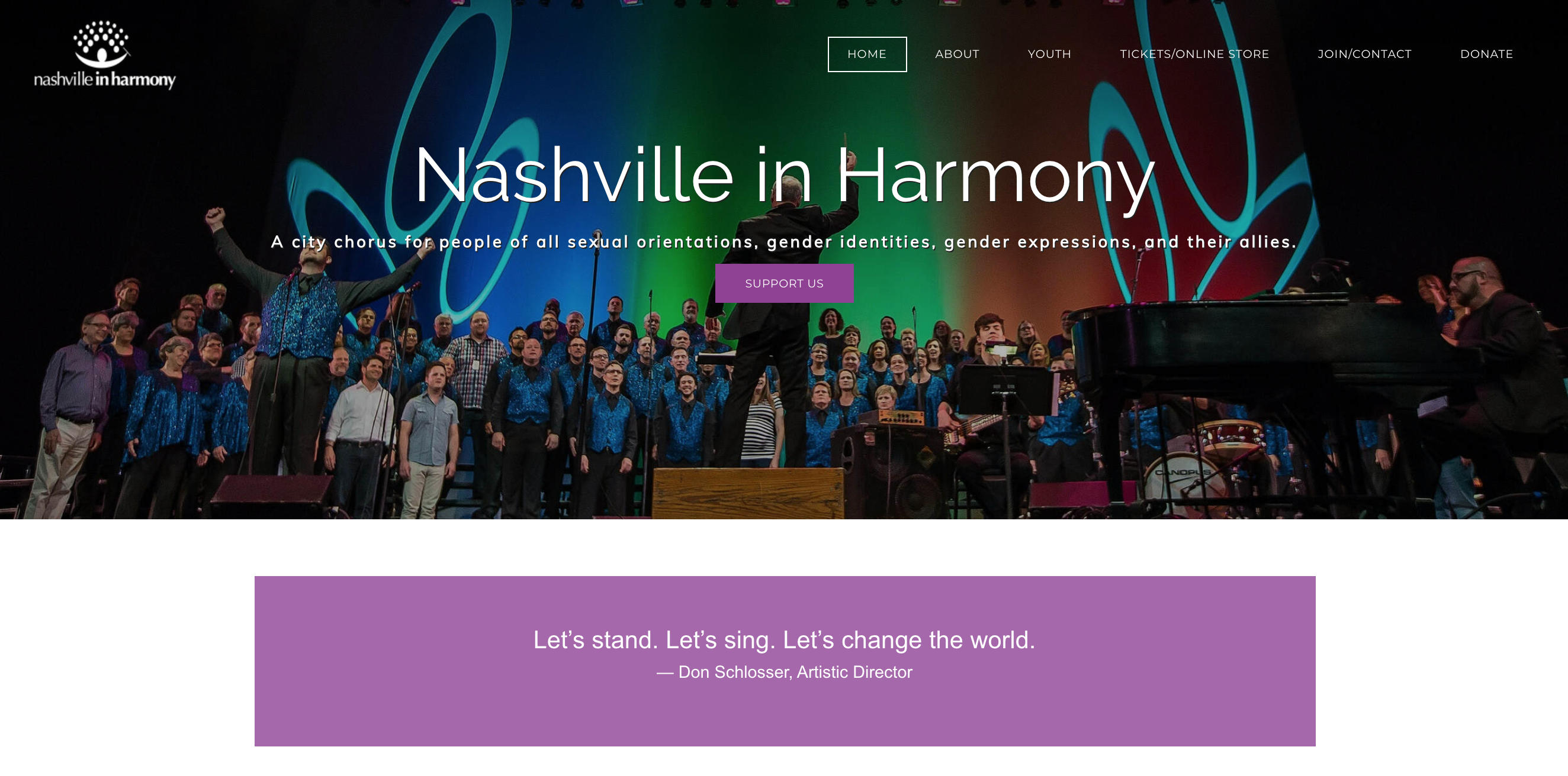
What I love about their website:
- Only one banner image at the top of the homepage with one primary call-to-action above "the fold" - this helps visitors focus on one action and they don't even have to scroll in order to do it!
- The about us page isn't a historical novel, it's short and concise with their most important call-to-action "Join Nashville in Harmony" prominently placed - this makes it easy for singers looking to join to know where to go to find more information.
- The dedicated donation page has a nice, embeddable widget for donating directly on the pages - this is a great user experience that makes it easy for the user to donate and ensures they stay on the site.
Concord Chamber Singers
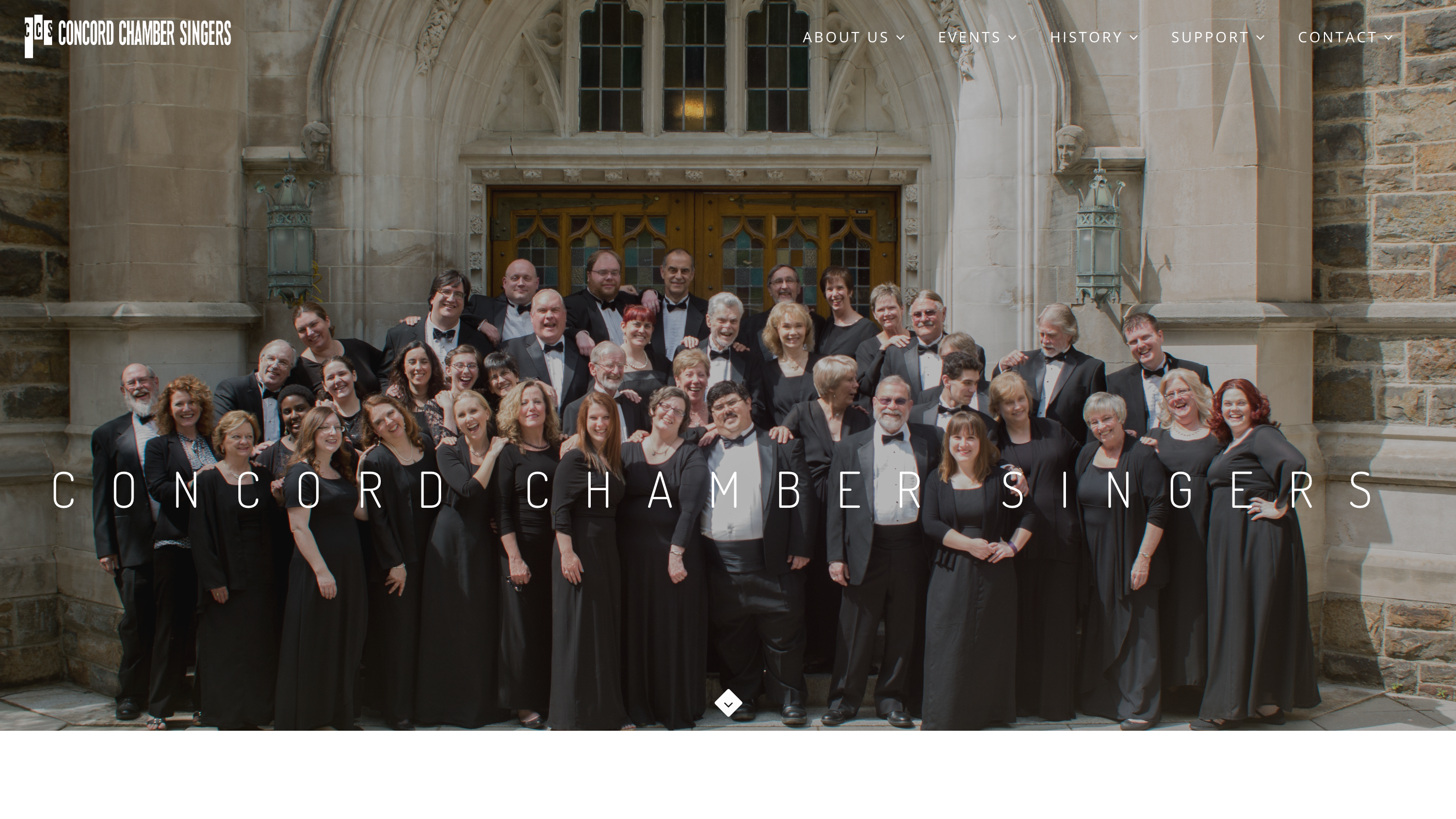
What I love about their website:
- The overall design is clean and sleek and the black and white color scheme gives it a professional look.
- Their homepage features reviews from audiences, singers, and press helping to build trust in their brand.
- Their vision page lists a clear mission, vision, and a detailed plan on how they will accomplish their goals.
- A prominent link to their members-only site for members in their footer.
Rackham Choir
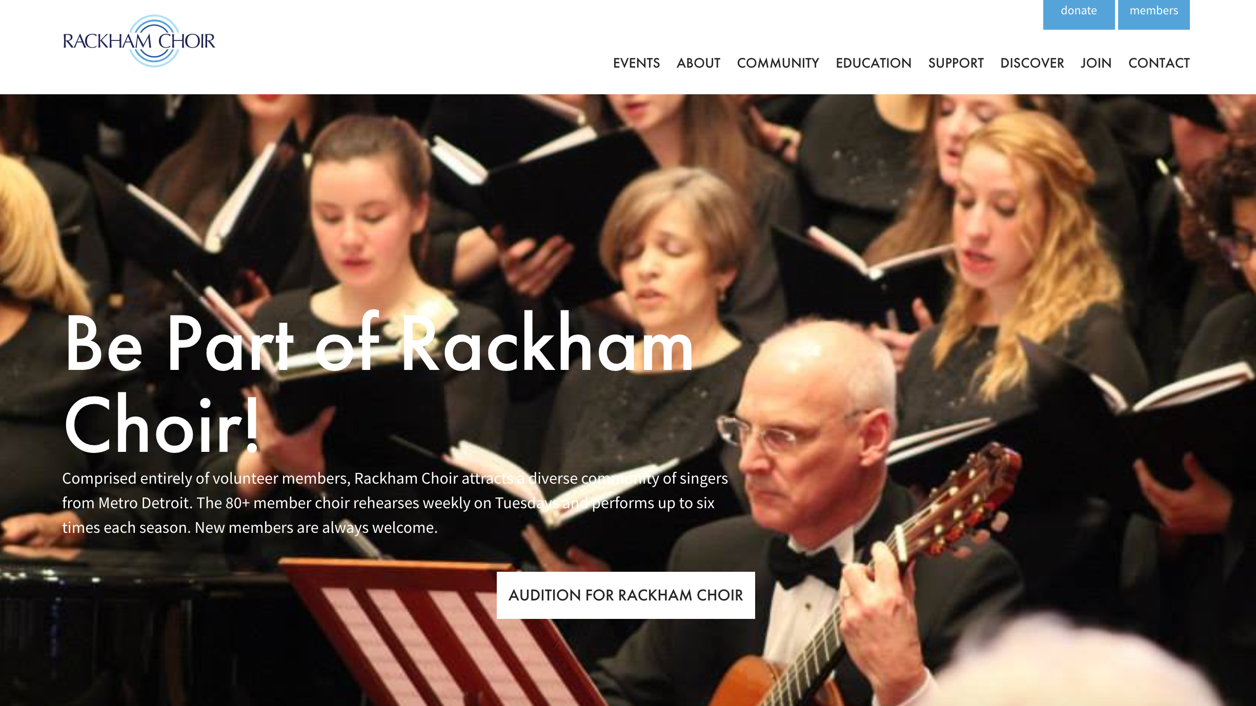
What I love about their website:
- Card-styled/block content on their homepage makes it easy to see each piece of content with a clear call-to-action.
- Partner/sponsor slider on their homepage is beautiful and interactive in a sliding carousel.
- Email sign up in footer of their website so users can sign up on any page!
- A clean, single-tier navigation with no need for drop-down menu - this helps users navigate through the site easily.
- Awesome community and education pages that showcase their impact on the community.
- Clean and modern events pages with clear calls-to-action to buy tickets and learn more about each event.
- Publicity pages are a great place to store press releases, media, news articles, and more.
- Beautiful, interactive donation page.
NewVoices Choir
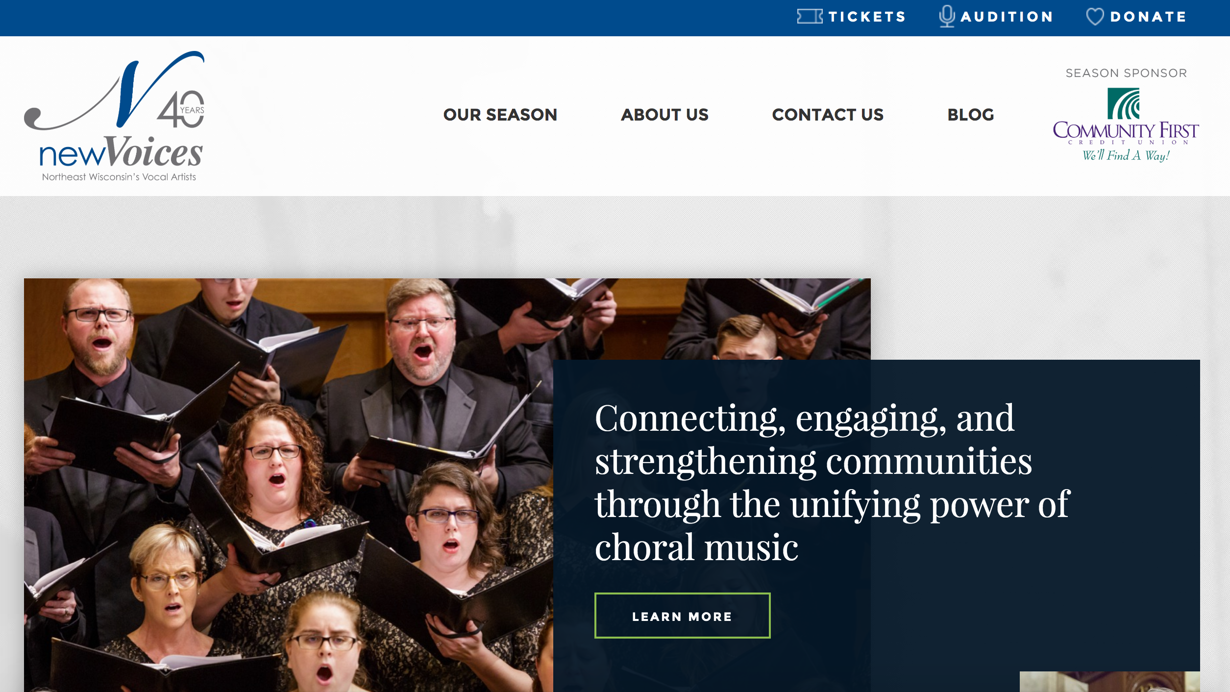
What I love about their website:
- Three main calls-to-action above the main navigation "Tickets," "Audition," and "Donate" - highlighting the three most important asks for any chorus. Each of those pages, by the way has a testimonial from one of their singers - a nice addition!
- Page dedicated to the venues they use for each concert with useful information for audiences such as parking and accessibility.
- The full season sponsor appears in the top navigation on their homepage, all sponsors are features in a scrolling carousel and on a dedicated sponsor page as well.
- Clear set of values and identity statement helps showcase their unique identity as a chorus.
Pittsburgh Girls Choir
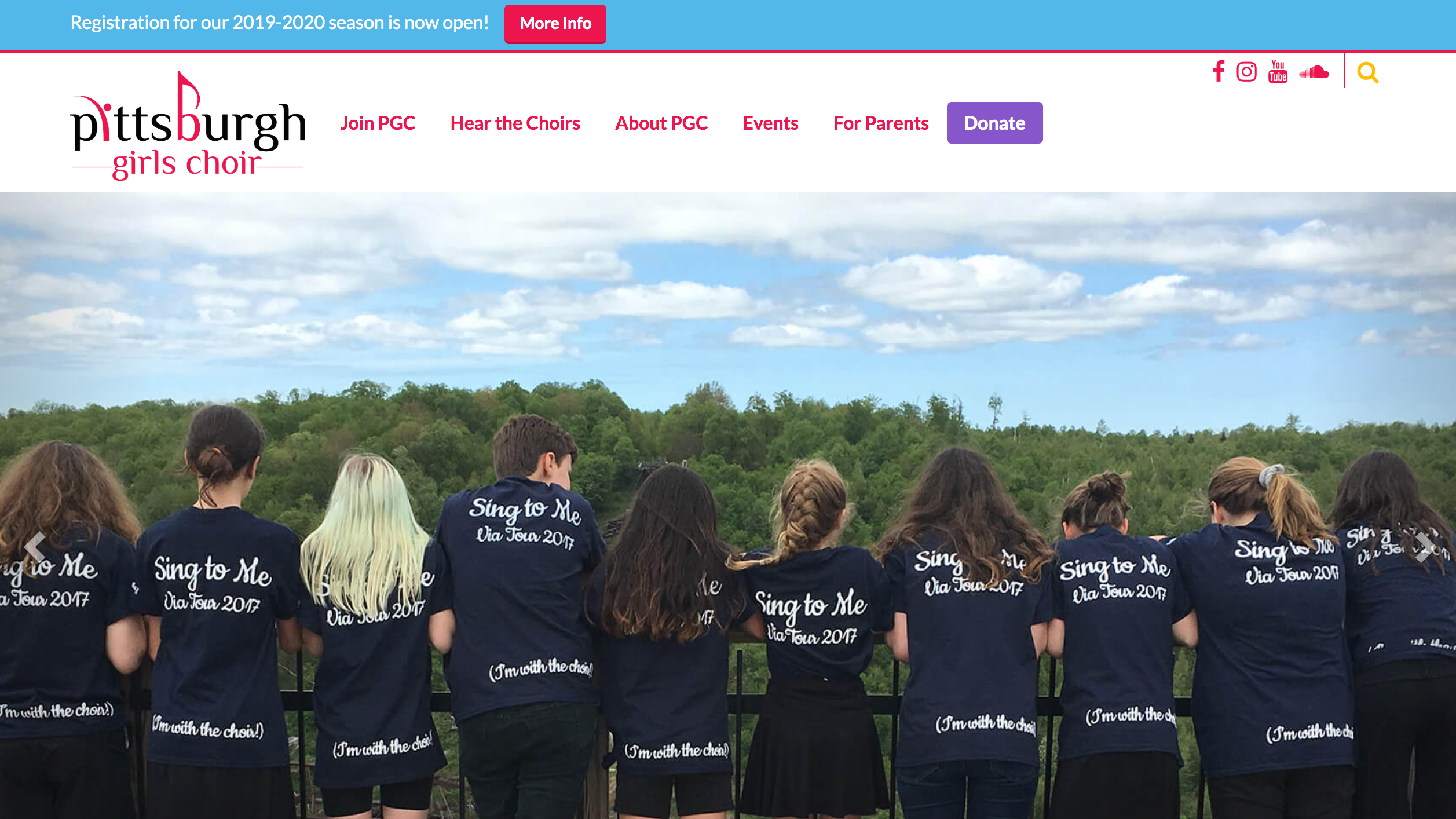
What I love about their website:
- Blue top banner call-to-action above the main navigation on every page to highlight their most important ask - to learn more about registering for the chorus.
- Similar banner at the bottom of their homepage to promote their email newsletter sign-ups.
- Block card style on their homepage and throughout the site gives the users very clear "learn more" call-to-action buttons to follow and makes navigating to other pages simple.
- Clear and vibrant branding and design elements throughout their entire website make the site look clean with a bright personality and encourages users to click on the fun colors.
- A dedicated area for parent information including a parent portal.
New Wave Singers of Baltimore
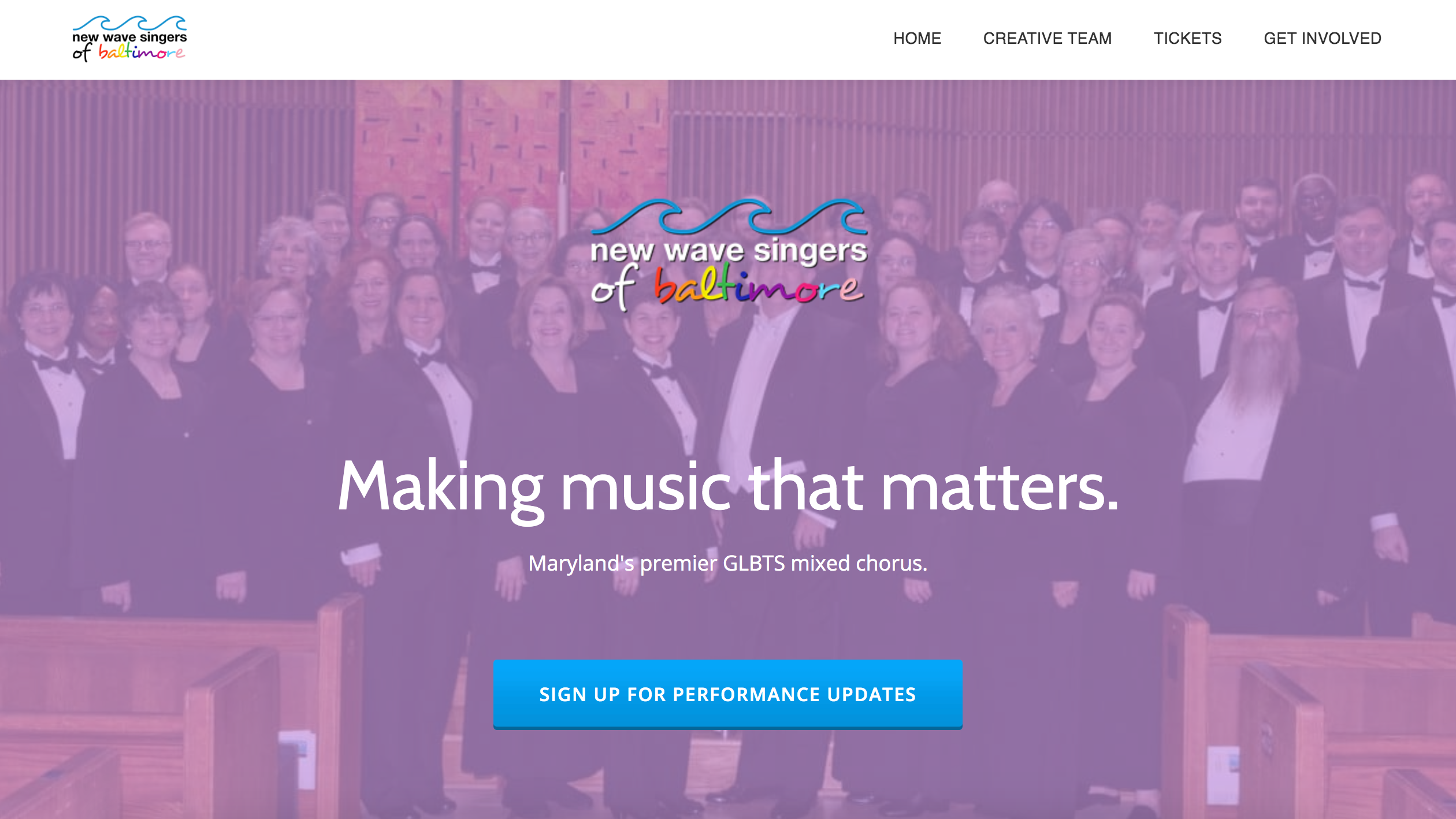
What I love about their website:
- A super simple site with only the content visitors need to see and very few pages to navigate through. There are only four navigation items and no drop-down nonsense - simple and easy.
- The homepage highlights only one primary call-to-action with the purpose of collecting contact information for their email list - this is a great way to build an audience by focusing first on simply getting contact information before asking for bigger things like donating or buying tickets!
- The homepage highlights first and foremost the chorus's value - their mission, vision, story, and member testimonials. Then, after they convince visitors of the the value, they make their second ask - to get involved.
Indianapolis Men's Chorus
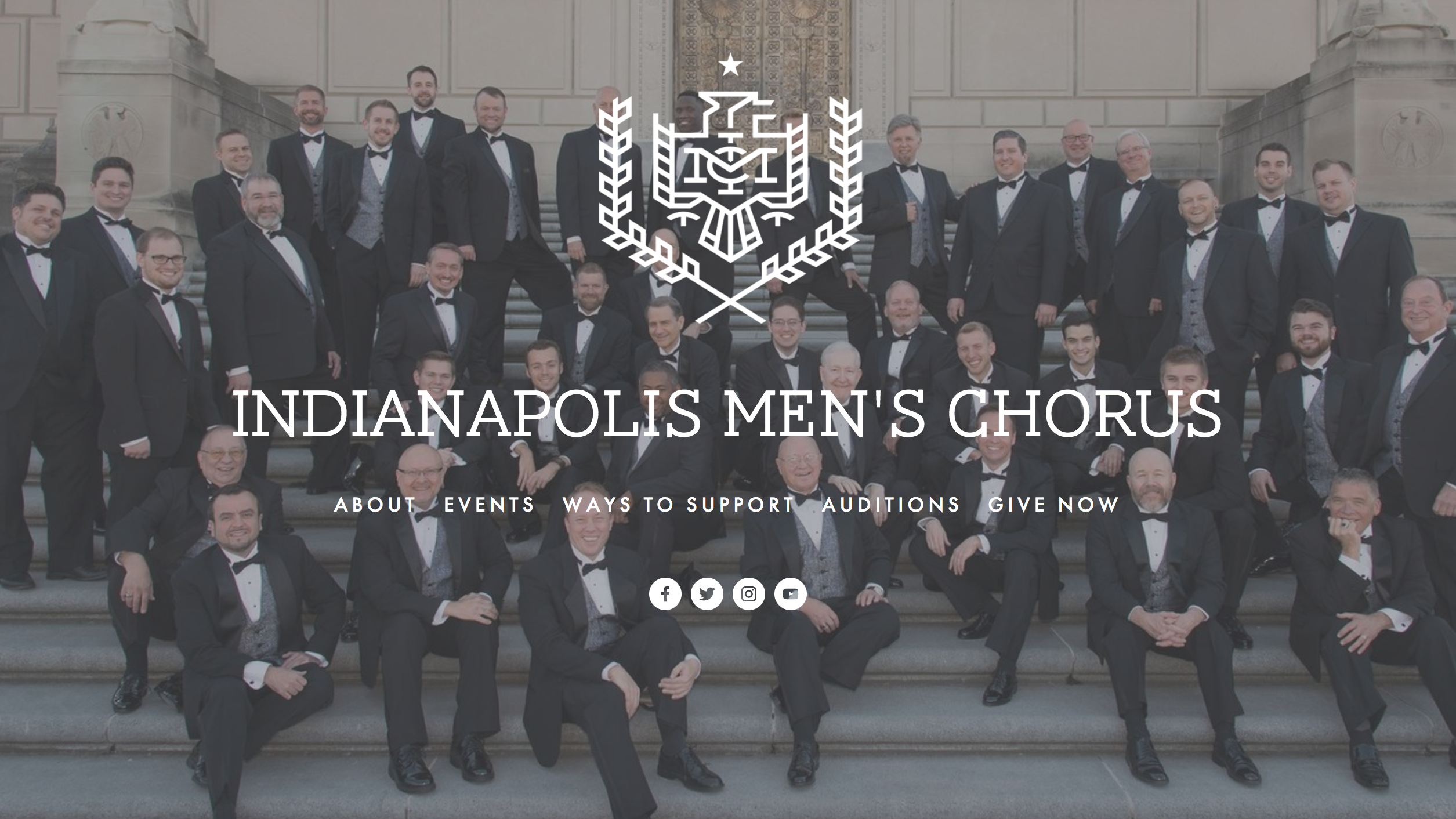
What I love about their website:
- The homepage of the Indianapolis Men's Chorus's looks quite different from other choral websites. Visitors arrive on a non-scrollable landing page with only five options in the navigation.
- About page focuses immediately on their mission and story first.
- The site is image-heavy with a parallax theme, making it visually appealing for visitors. Plus, the overlay text is still readable - very important!
- Auditions page clearly identifies responsibilities.
- Overall, it's super clean, simple, and sleek.
Orange County Women's Chorus
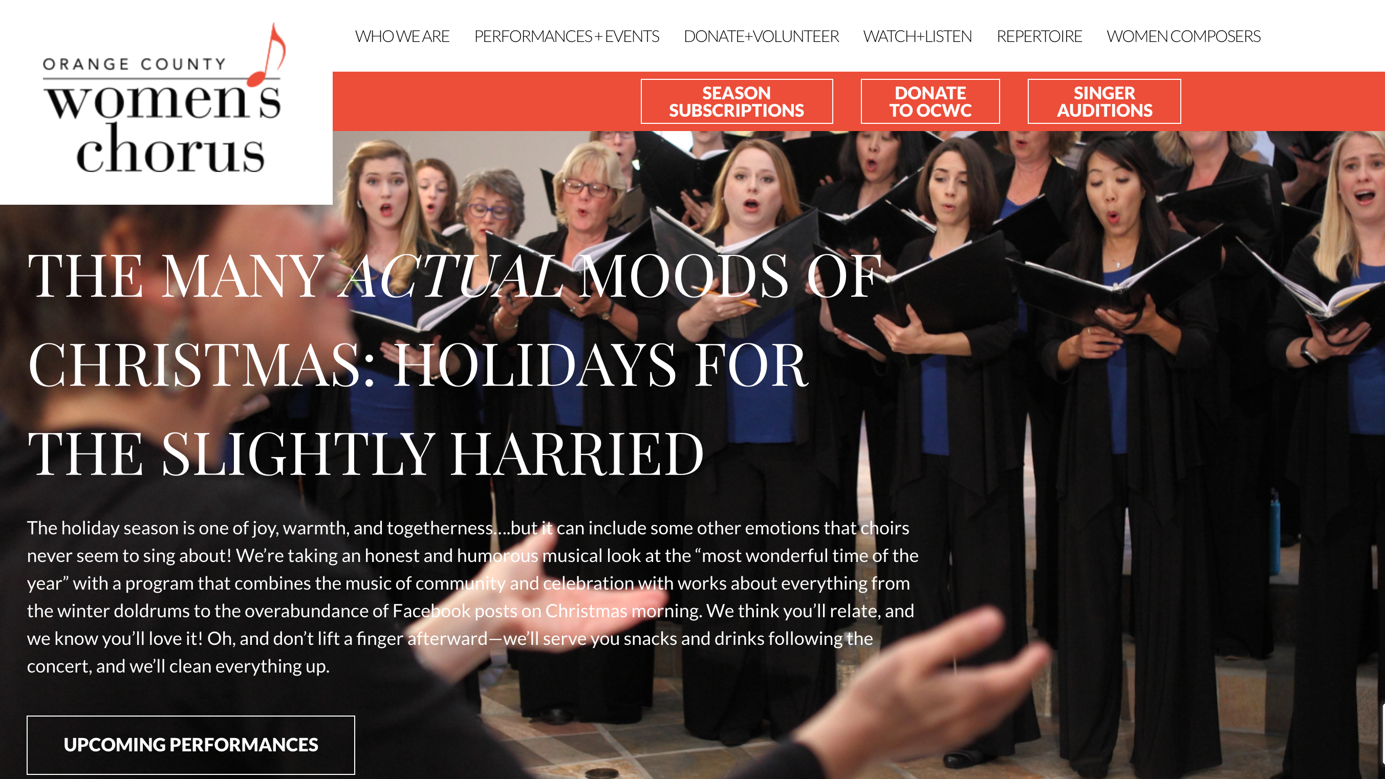
What I love about their website:
- The logo animation in their navigation!
- A video right on their homepage about the chorus.
- An "adopt a singer" content box on their homepage - a clever way to get support for the chorus while also highlighting member stories.
- An email newsletter signup form that stays just above the footer on every page.
- Clear call-to-action to buy tickets after each event on their performances page.
- Highlights recurring monthly donations on the donate page.
- A clever way of listing where the money goes on the individual donations page.
Calgary Men's Chorus
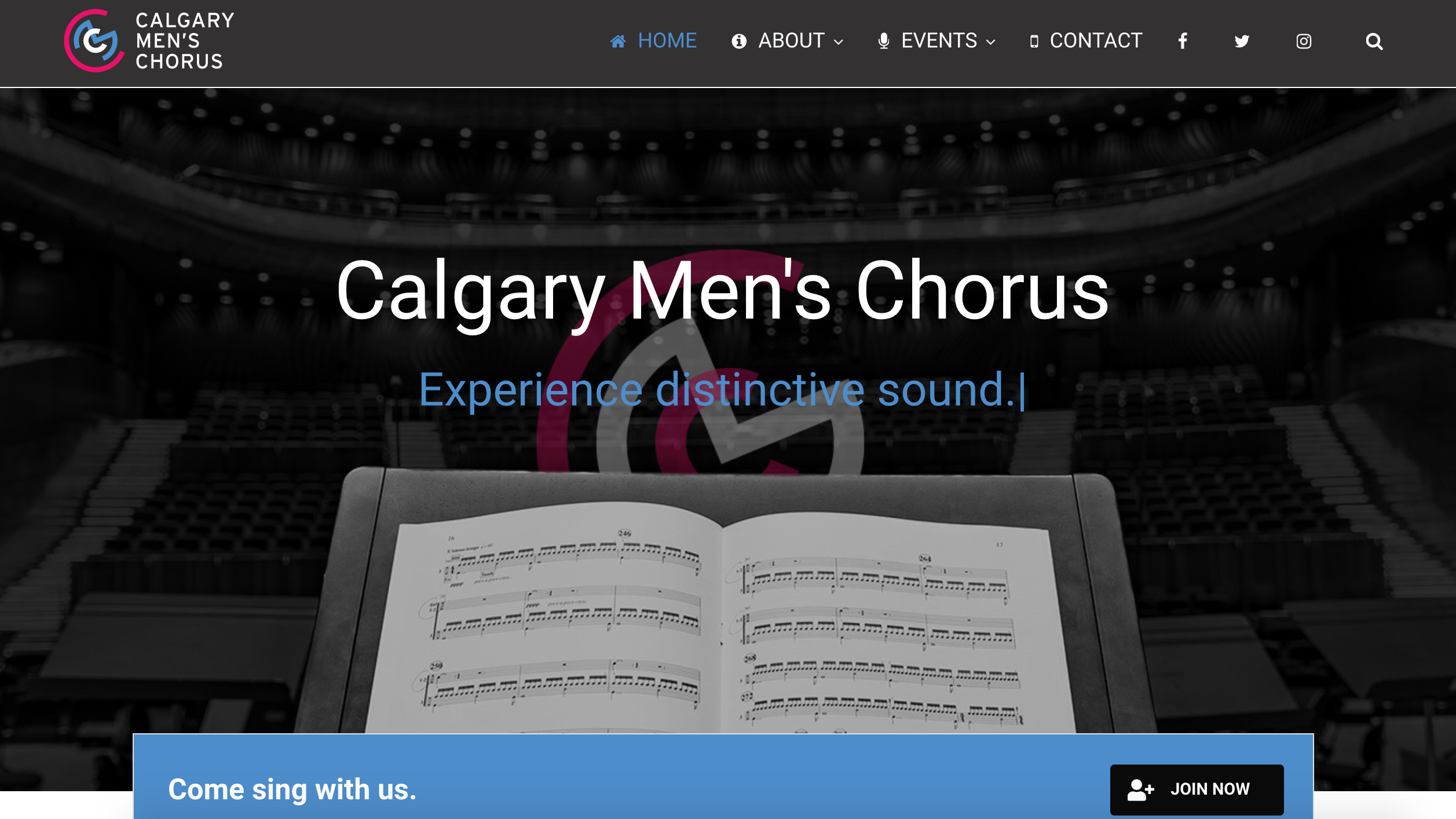
What I love about their website:
- The homepage typing animation helps get their message and value immediately across to their web visitors without the need to scroll.
- After their homepage banner image, there is a prominent call-to-action "Join Now" which surely encourages anyone to click.
- The "buy tickets" embeddable widget is clean and pops up in a modal.
- Instagram is embedded on their homepage - which can help boost social engagement and followers!
- A common questions page with FAQs about joining the chorus - this helps answer the web visitor's questions up front.
- Archived concert pages.
- Contact us page lists several ways for web visitors to get in touch. It's also really pretty.
Arts Chorale of Winchester
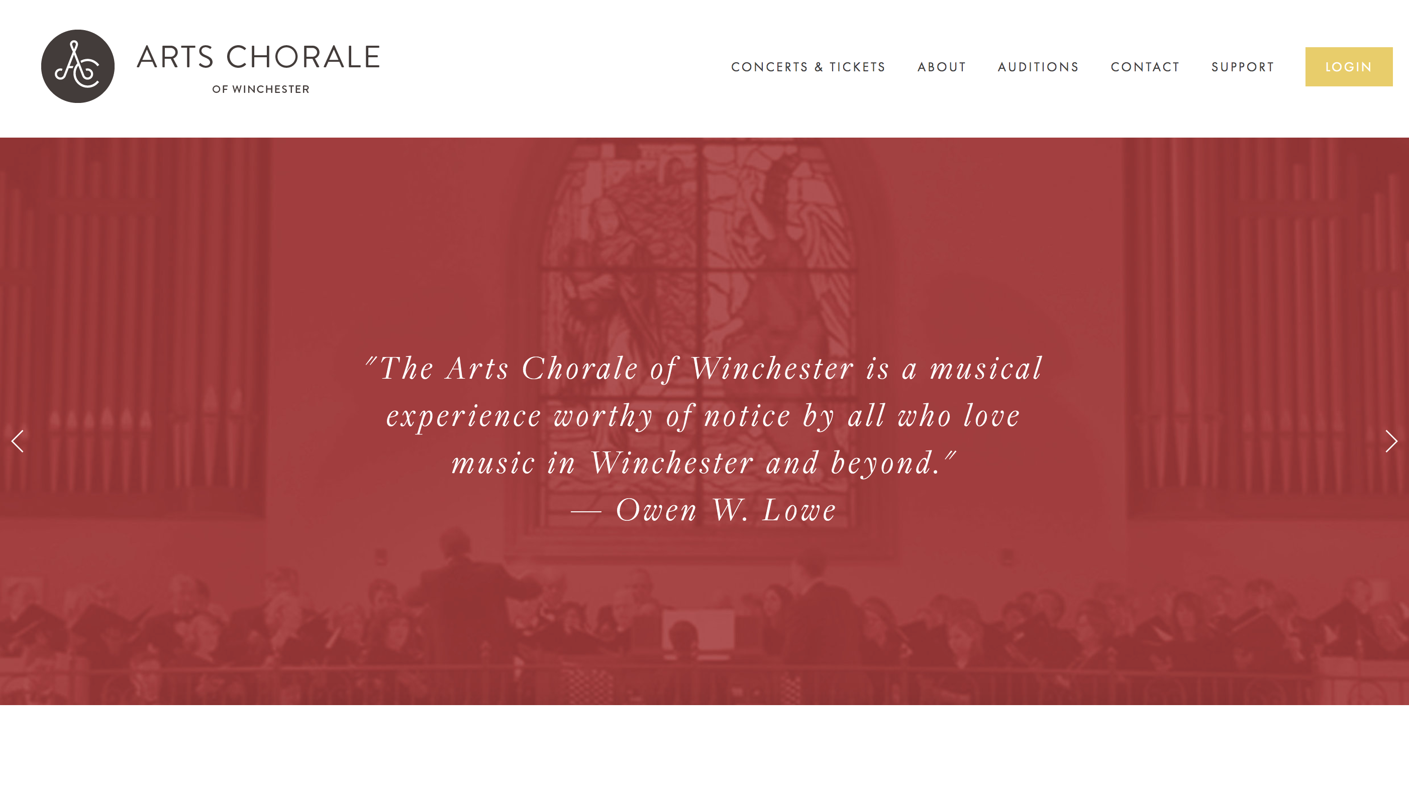
What I love about their website:
- Dismissible pop-up above their navigation with a call-to-action to support the chorus - a great way to highlight an ask while still offering the visitor a chance to exit or dismiss it!
- Testimonials on the homepage banner image - showcases value front and center.
- Large fonts and limited texts across the site help focus users on the most important content without having to read a whole lot.
- Email signup option in the footer so it is visible on every page.
- Only one call-to-action "buy tickets" on each concert page.
- A great video archive of past performances.
San Francisco Girls Chorus
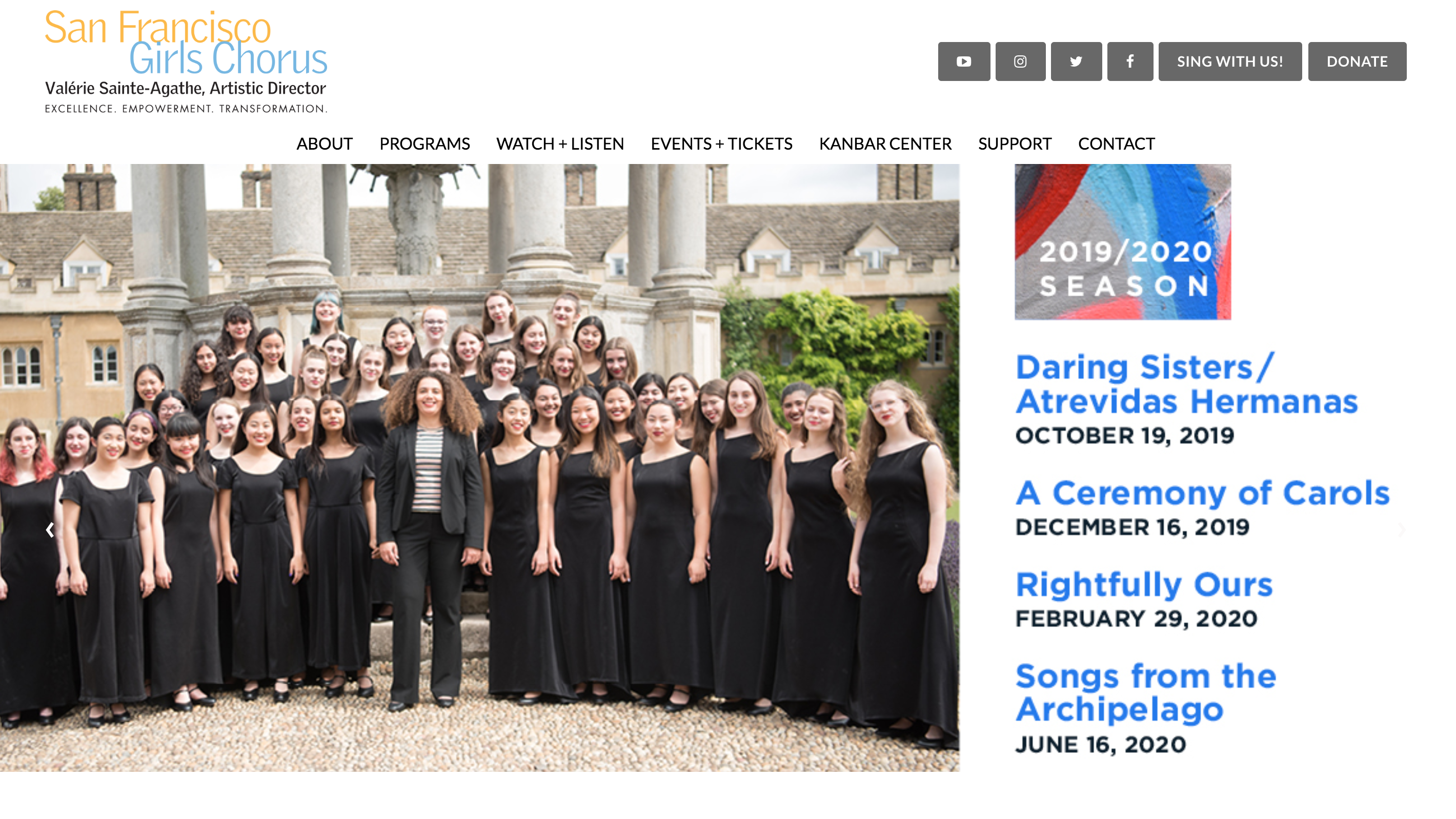
What I love about their website:
- An alumnae program with awesome benefits for their past singers - a great way to engage youth singers after they've moved on!
- Support page offers specific statistics and metrics about the chorus to ensure donors that their money matters. Plus, a great template for what an annual report could and should look like for donors and supporters.
- An area dedicated for foundation giving and corporate sponsors - a great way to thank funders.
- Bookings page helps get the word out that they are available for hire.
- Email sign-up form in the footer of every page.
- Commissioning page highlights the important work they are doing to support the composers of today.
SoHarmoniums
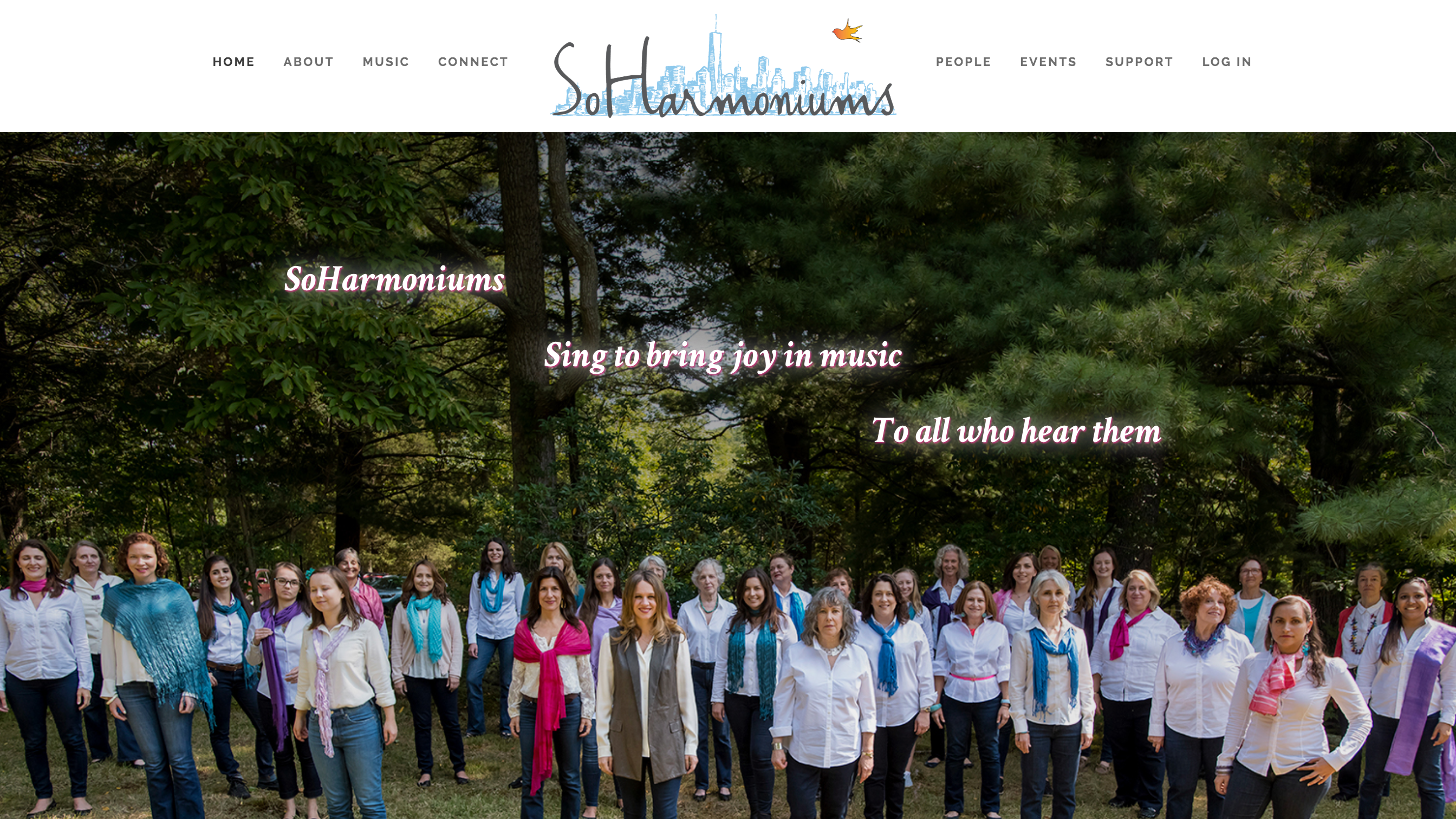
What I love about their website:
- "Meet the SoHarmoniums" video right on their homepage and videos of the chorus singing.
- Recruitment picture on the homepage shows the chorus in matching chorus shirts - a great way to showcase the social and community components of the chorus.
- Their newsletters appear right on the site - this allows visitors to get a peek into the internal community.
- Every singer has a picture and bio up on the site - one way to show off the chorus's unique personality.
MenAlive Orange County Gay Men's Chorus
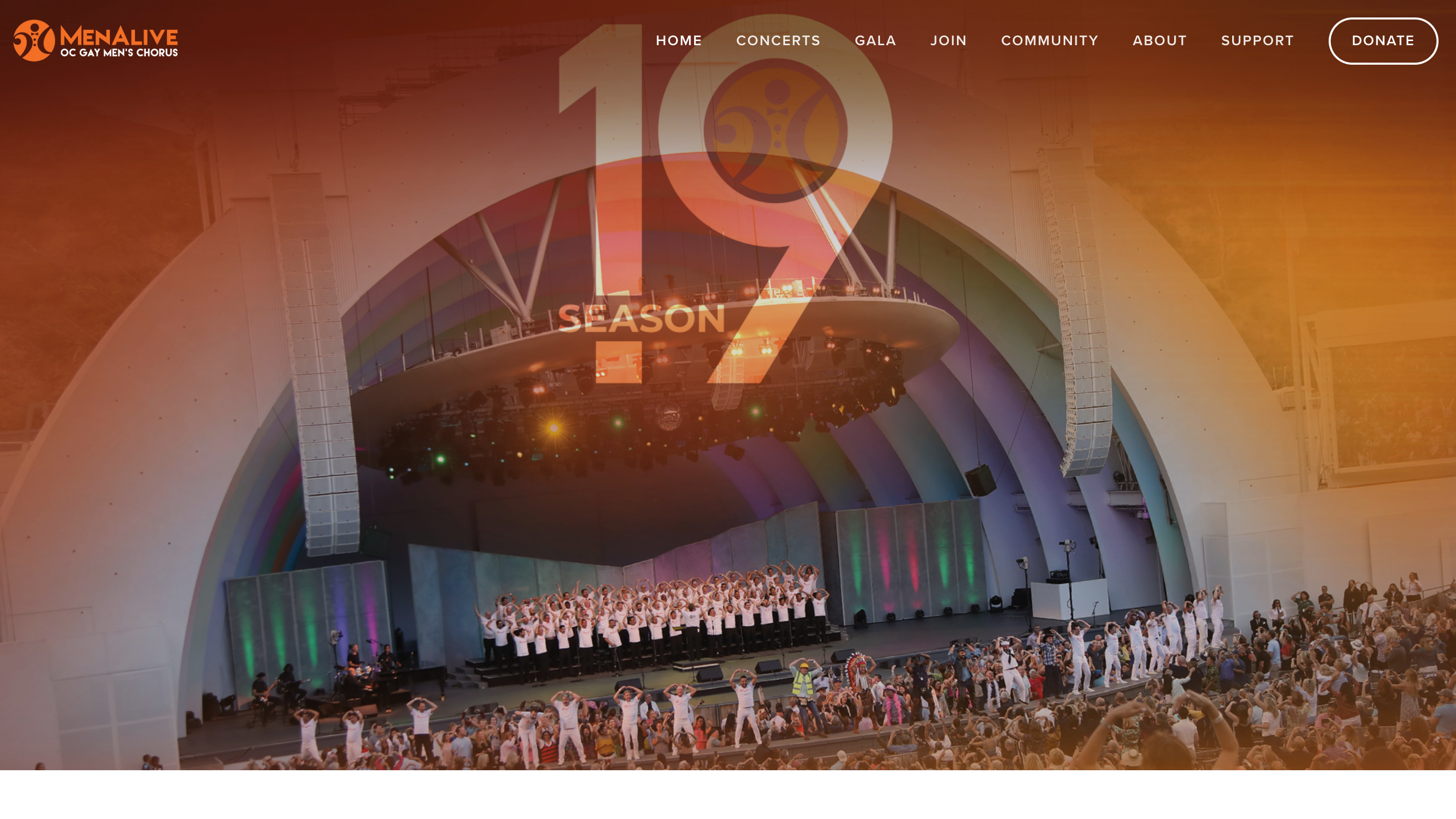
What I love about their website:
- Striking imagery and banner images on every page particularly their homepage and concerts page.
- Subtle animation on images - it's just enough to be visually appealing without being distracting.
- Chorus staff and board all have professional headshots all against a MenAlive chorus backdrop.
- A beautiful in memoriam page to honor those singers who have passed away.
- Their Encore Circle page honors shows sponsorship opportunities and even offers a monthly installments option.
Common Woman Chorus
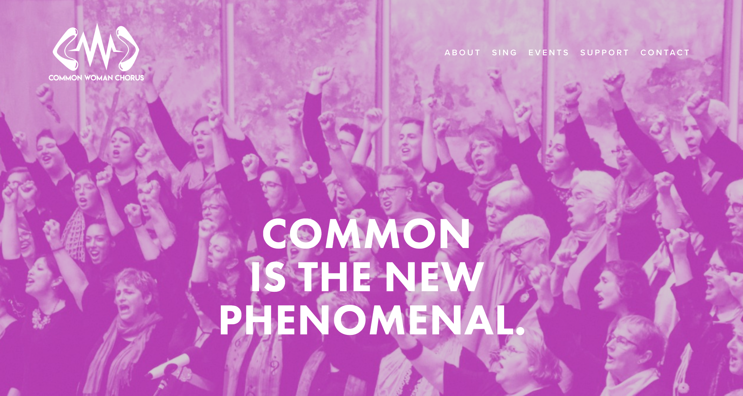
What I love about their website:
- A catchy headline on their banner image of the homepage - shows their personality and inspires immediately.
- Instagram feed on the homepage shows off their personality even more and likely boosts engagements and followers.
- Sing page lays out the expectations and dues up front for potential auditionees.
- A herstory page - 'nuff said.
- Simple but effective site - they don't need a lot of pages to get their point across.
Hamilton Children's Choir
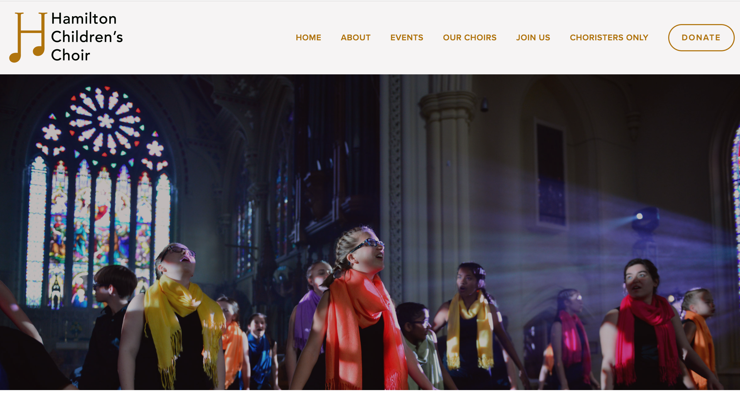
What I love about their website:
- The homepage features a wonderful video about singing with the chorus - awesome content to share on a homepage!
- A clear set of values and their educational approach - this can help give parents and understanding of how their children will learn.
- Each ensemble has their own dedicated page with useful information - a great way to showcase several ensembles in a clean way.
- A page dedicated to volunteers gives people outside of the organization the opportunity to step up and give back.
- The careers page features another excellent video which will surely inspire anyone looking for work in the arts!
- Tuition and registration fees are listed up front with financial award programs as well.
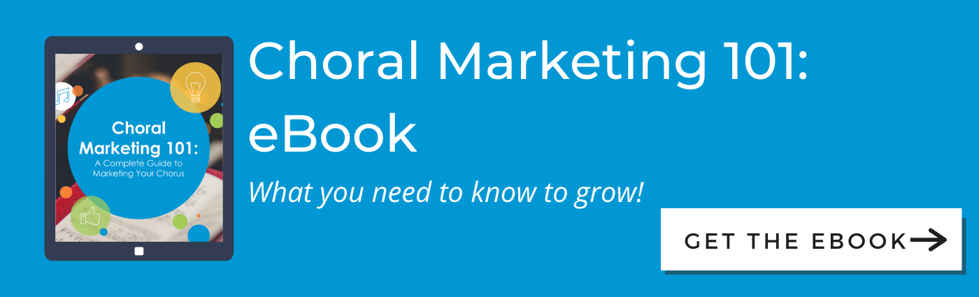
I hope these websites inspire you as much as they have inspired me! If you'd like to learn more about making phenomenal chorus websites, download our Choral Marketing 101 eBook.

Tori Cook is the former Director of Sales & Marketing at Chorus Connection, an active board member of the Greater Boston Choral Consortium, and a soprano with the Tanglewood Festival Chorus. In a past life, she was the Music Director of the Harborlight Show Chorus and President of Chorus pro-Musica. When not making music, she daydreams about adopting a golden retriever puppy and scuba diving to exotic locations around the world.