
Let’s be honest: chorus websites often start strong… and then quietly spiral into digital dustbins of outdated season info, missing links, and mysterious navigation menus.
We’ve all been there. You’re busy planning concerts, writing grant applications, managing volunteers—and trying to remember where your website login info is stored. But here’s the truth: your website is your most important marketing tool. As my mentor and Chorus Connection blog collaborator, Jen Rogers, always says: “It’s not really real until it’s on the website!”
Your website is where people go to learn about your chorus, buy tickets, donate, sign up for your emails, and—most importantly—trust that the information they find is current and accurate. That’s why it’s essential that someone on your team (maybe you?) has direct access to keep it updated. Even if you’re not a web designer, you should be able to log in and add basic concert details.
Because if your patrons can’t count on your website to be up-to-date, they’ll stop checking it. And that’s a missed opportunity you can’t afford. Whether you're revamping your site this season or just doing a maintenance check, here are 10 common website mistakes to avoid—and what to do instead.
1. Keep Your Homepage Current
Your homepage is prime real estate. If the most recent thing on it is a concert that happened three months ago, it can feel like walking past a dark theater with a dusty marquee. It sends a message (even unintentionally) that nothing’s going on—and that’s rarely true for a nonprofit chorus!
Even during your “off-season,” you likely have something to promote:
- A summer fundraiser
- A singer recruitment campaign
- A mailing list opt-in
- A highlight reel or video from your last performance
- Some other kind of perennial content
So after your final curtain call of the season, don’t let your homepage go dark. Instead, replace that concert promotion with a fresh call to action like:
- “Be First to Know: Join Our Email List”
- “Revisit the Magic – Watch Highlights from [Concert Name]”
- “Donate Now to Support Next Season’s Music”
Think of your homepage as the front-of-house staff that greets visitors. Don’t leave them standing in the lobby with no direction!
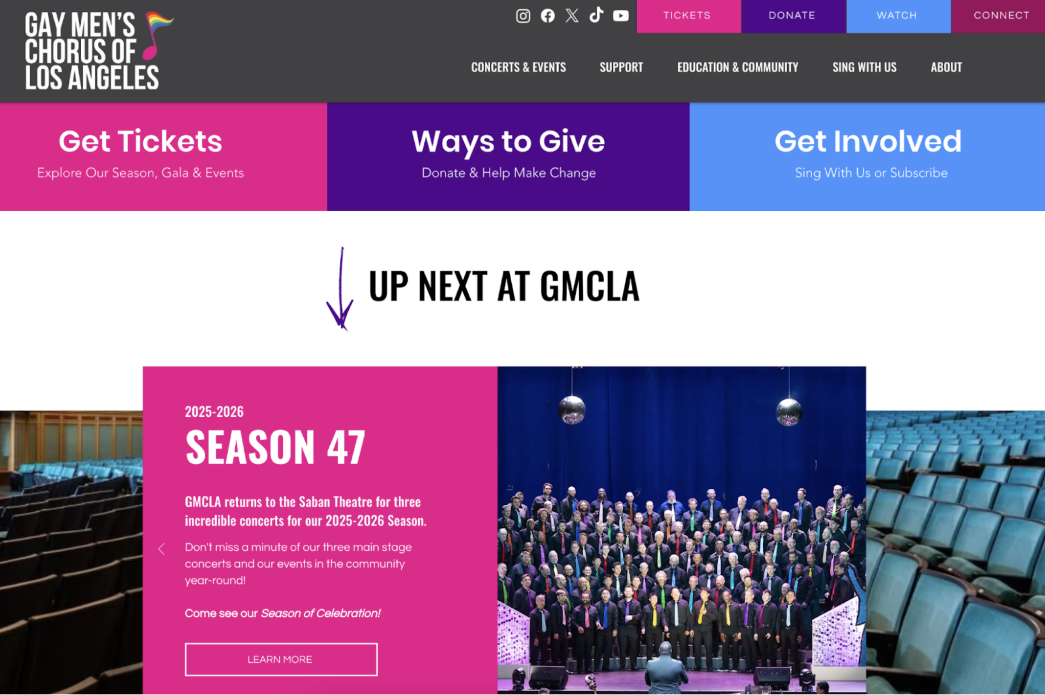
In the example above, the Gay Men’s Chorus of Los Angeles does a great job of directing visitors and even color-coding the actions they can take. You don’t have to scroll far on their homepage to get current season information, well in advance of the first concert date!
2. Streamline Your Season Page
We know every concert is a labor of love, and it’s tempting to give each one its moment to shine right on the main season page. But here’s the hard truth: if visitors have to scroll past an ocean of paragraphs and oversized graphics just to see what else you’re offering, they might check out before they get to the good stuff.
Instead:
- Give each concert a neat little preview: title, date/time, short description, thumbnail image
- Add a “Learn More” or “Get Tickets” button to link to that concert’s full or landing page
- Keep the main season page under 2–3 scrolls in height
Remember, attention spans are short—especially on smartphones. If someone’s browsing during a lunch break or from a seat at another performance (it happens!), you want them to get the gist quickly.
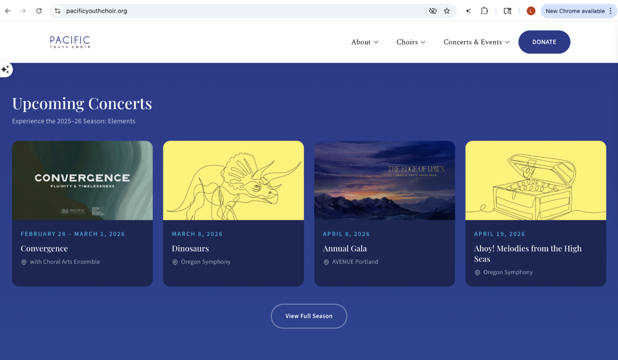
In the example below, the Pacific Youth Choir gives a quick overview of all its upcoming concerts, which are easily viewable with just one scroll on the homepage.
Still want to tell a deeper story? Great! That’s what individual concert pages are for. Just make sure your main season page is skimmable at a glance.
Pro Tip: If you’re struggling to shorten your concert descriptions, let AI help. Tools like ChatGPT are useful for summarizing larger pieces of text into short, digestible blurbs.
3. Put Your Contact Info in the Footer
I get it—clean, modern footers are stylish. But don’t let minimalism come at the expense of clarity. Your patrons, prospective singers, journalists, or donors might be trying to reach you. Don’t make them go on a digital scavenger hunt.
Here’s what your footer should at least include:
- Organization name
- Mailing address
- Email address
- Phone number (if applicable)
- Social media links
- A “Contact Us” link or page
Why does this matter? Because not everyone knows where to find this info if it’s buried. You might be surprised how many people still prefer calling or mailing a donation check—and they’ll need a way to do that.
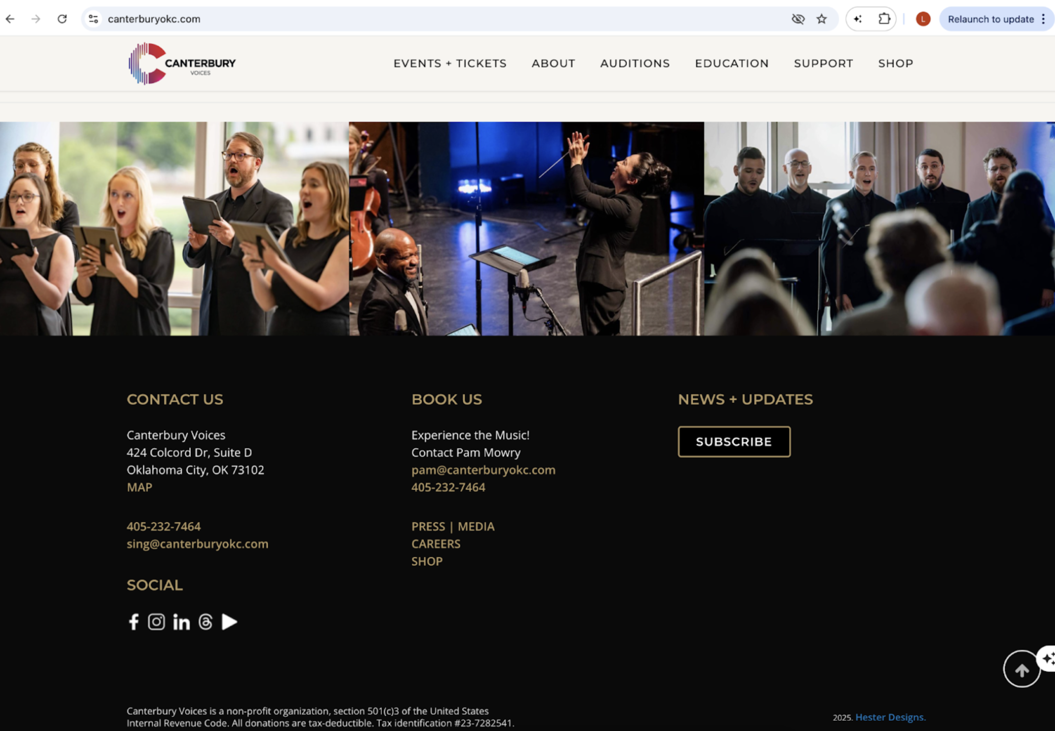
Canterbury Voices nails this with a footer that’s clear, complete, and visually clean. They even include earned media links and press info, which is a smart SEO move.
4. Create an FAQ Page
Even if you’ve got a beautifully written homepage and a clean navigation bar, patrons will have questions. About tickets. About refunds. About parking. About accessibility. You name it.
Rather than answering the same emails over and over, make your website work for you with an FAQ page that covers:
- Venue info and parking details
- Accessibility (seating, restrooms, assisted listening devices)
- Ticket refund or exchange policies
- What time the doors open for seating
- Dress code (Is it formal? Can they wear jeans?)
Update your FAQ page each season, especially if venues, policies, or pricing changes. Keep the language friendly and casual—this is your chance to anticipate needs and make patrons feel confident and cared for.
Pro Tip: It’s absolutely okay to update your website with this information as it becomes available before your concert. You don’t have to have everything in advance—at least a week before is helpful!
5. Let Families Know if Kids are Welcome
Concert-going parents are bringing your future superfans with them—but only if they feel included and prepared. If children are welcome at your concerts, say so explicitly.
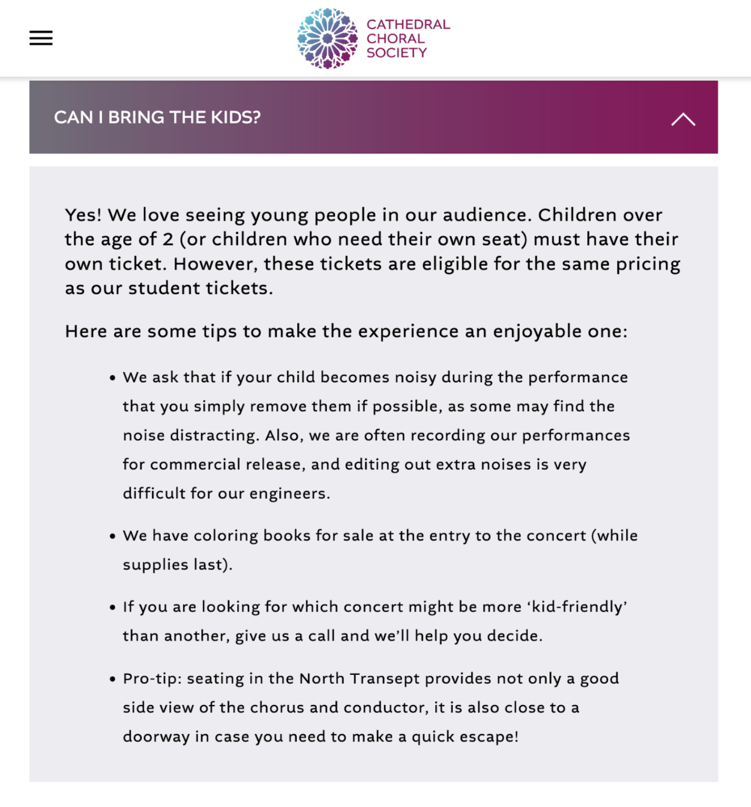
Use language that’s both welcoming and honest. The Cathedral Choral Society offers a great example by letting patrons know:
- Some concerts are more kid-friendly than others
- Coloring books are available
- It’s okay to step out with a noisy child
Even if you're not offering a full family series, just clarifying expectations can ease anxiety for parents (and for the other audience members wondering if a toddler might attend). Transparency creates trust—and encourages attendance.
On The Cathedral Choral Society’s FAQ page, they include a section on whether kids are welcome, and it’s written in a friendly and transparent way.
6. Customize Your Page Titles and Meta Descriptions
Think of your page title and meta description like the program notes for your website. They’re the first thing people see when your chorus pops up in a Google search.
It’s important to make sure your page titles are customized, not just because they’re your digital first impression, but also because it’s good for SEO.
Here’s why it matters:
- Search engines love clarity — A well-crafted page title tells Google exactly what your page is about, which helps it show up higher in search results.
- People love clarity too — A clear, inviting title and description let people know what they’ll get if they click, which makes them more likely to actually do it.
- More clicks = better performance — When more people click on your link (this is called your “Click-Through Rate” or CTR), search engines take it as a sign your page is useful, which can boost your rankings even more.
So, just like writing a catchy concert program blurb, your titles and descriptions need to do double duty: keep the algorithms happy and grab attention from real people scrolling through search results. This helps with SEO, accessibility, and the user experience. Check out our recent blog for examples of informative and enticing page titles and descriptions.
Pro Tip: While you’re at it, make sure your favicon is customized, too! A favicon is that little image that appears in the browser tab (and in bookmarks) to let people know what website they’re on. If yours is still a WordPress “W” icon or other generic icon, you’re missing an opportunity to make your digital presence even more professional.
Using your logo is preferred, but a musical note or any visual that aligns with your brand identity will work as well. It’s a small thing, but it boosts brand recognition and makes your site look more polished!
7. Use Photos on Your Homepage (Not Just Graphics)
Beautiful design matters. But connection matters more.
When someone lands on your homepage, one of the most powerful things you can show them is your singers—real people, really singing. Real photos do more than make your site pretty:
- They humanize your mission
- They show your ensemble’s size, diversity, and energy
- They create an emotional connection
Even if you’re short on high-res professional photography, smartphone pics from a dress rehearsal can go a long way. Show the music in action. Show the joy. Let people imagine themselves in your seats—or on your stage.
8. Make Your Email Sign-Up Easy to Find
Your email list is a powerful marketing tool. Yet many choruses bury their sign-up link at the bottom of a single page, or fail to feature it altogether.
Here’s how to do it better:
- Place a clear sign-up box or button on your homepage
- Include an email signup link on your “About” and concert pages
- Use engaging language like, “Be first to know about concerts and events!” or “Join our email family.”
Connect your sign-up to your email platform (like Mailchimp or Constant Contact) so it updates automatically. Then keep those subscribers engaged with beautiful, timely email content.
9. Include a Bold, Consistent Donation Button
Your audience wants to support you. But if you don’t ask, they won’t give. And if your donate button is buried in the footer or disguised as a tiny link, you’re creating an unnecessary hurdle to them supporting you.
Your donate button should be:
- Brightly colored and easy to find
- Always visible on the homepage and header menu
- On its own landing page with details on how to give with a big button
Don't save your donation ask for once a year. Let people support you when they’re inspired—like right after watching a moving concert video or reading about your impact.
10. Use Accessible, High-Contrast Colors
Design matters—but so does usability. Light gray text on a white background? Tiny links that disappear on hover? No, thank you.
Web accessibility is often overlooked, but it’s vital—especially in the arts, where your audience includes people of all ages and abilities.
And don’t forget to apply those rules to your social media icons. If your black Facebook logo is fading into a dark footer background, chances are no one’s clicking.
✖️ Common issues to avoid:
- Light gray text on white background
- Dark icons on dark backgrounds
- Busy backgrounds that obscure buttons or links
Test your site using a contrast checker tool like WebAIM’s Contrast Checker to assess your palette and ensure your fonts and colors are readable for everyone, including those with visual impairments.
Other things to consider:
- Font size and clarity
- Button size (especially for mobile users)
- Alternative text for images
Inclusion online is just as important as inclusion in your concert hall.
Your website doesn’t need to be fancy to be effective—but it does need to be thoughtful, intentional, and updated. When in doubt, think like your audience: What would I want to know if I were new here? What would make it easier for me to connect, support, or attend?
Small improvements, made regularly, can make a world of difference.
And remember—just like in music, perfection isn’t the goal. Progress is. Start where you are, and keep building. You’ve got this!
After reading this blog, what’s the first thing you’re going to improve on your chorus’ website? Are there any chorus websites that you admire or that you’ve used to inspire your own website design? Let us know in the comments. We’d love to hear your thoughts!

Lauren is a digital marketing consultant who helps choral organizations tell their stories with depth, sincerity, and impact. With a background in journalism and a passion for performing arts, Lauren brings a documentary-style approach to content, crafting compelling narratives that go beyond promotion to build lasting connections. She has worked with Grammy-winning groups like the Phoenix Chorale and Tonality, where she led social media and marketing efforts during their 2024 Grammy win. She also led branding, website, social and marketing for Helios: A Modern Renaissance. As a former vocal performance major, Lauren has had the opportunity to perform with several choral ensembles in Arizona, and when she’s not serenading her two cats, Lauren can be found supporting the arts, eating tacos, and visiting her family back home in Australia.